Why dynamic bundles outsell static packs
A merchant recently replied to our outreach with this (translated, name withheld):
For the refill blades I already have a value bundle: you can buy one set, or a set of four. Thanks for thinking along! 😊
And they were right. We checked: the store really does sell a 4-pack at a lower per-unit price. The offer exists. The math works. Nothing about it is wrong.
Here is the uncomfortable part: having a bundle and selling a bundle are two different jobs. That 4-pack lives on its own page, with its own URL, waiting for a shopper to find it, open it, and do the price comparison by themselves. On the single product’s page, where the actual buying decision happens, nothing even hints that it exists.
The generic version of this pattern, which we see in store after store: a shampoo bottle sells for $5. The merchant creates a second product called “Shampoo (4 bottles)” for $18, or adds a variant dropdown: Single ($5) or 4-pack ($18). Functionally, a discount now exists. Psychologically, nothing happens.
The static pack, faithfully recreated

Everyday Shampoo
US$5.00
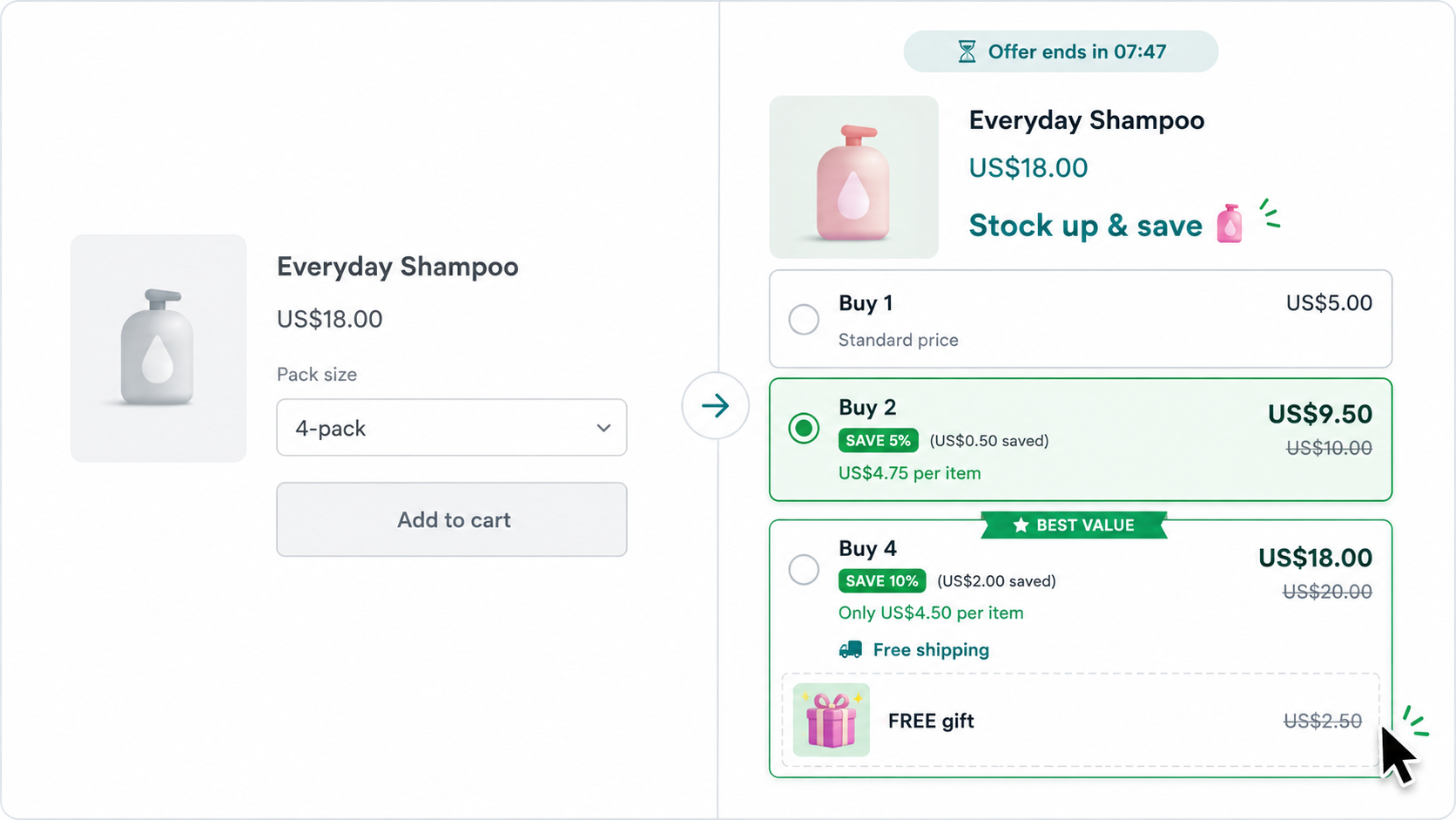
That is the entire experience. Notice everything that is not there: no crossed-out reference price, no savings amount, no suggested option, no reason to decide now. The shopper who picks “4-pack” has to run the numbers alone: four times $5 is $20, so $18 saves… $2? That’s 10%? Nobody opens a calculator for shampoo. The discount is real, and invisible.
The separate-listing version is strictly worse: the comparison now lives on a different page, and the single-bottle page (the one your ads and search traffic land on) sells only the $5 option, silently.
The same offer as a dynamic bundle

Same product. Same $18 for four bottles. Everything else changed: $20.00 is crossed out next to $18.00, the savings are spelled out, one tier is pre-selected and labelled BEST VALUE, and the per-item price does the division for you. Flip the chips, and a countdown and a free gift attach to the exact tier we want the shopper to pick. This is a live widget from our demo; you can see it running on your own store’s products there.
The psychology, with receipts
None of this is decoration. Each element maps to a documented, repeatedly-replicated effect in consumer research.
Anchors make the discount visible
People do not evaluate prices in a vacuum. They judge them against a reference point, and whatever number is shown first becomes that reference. This is anchoring, documented by Tversky and Kahneman in 1974 and confirmed in pricing contexts ever since. “$20.00 $18.00” gives the brain an anchor and an instant win. A bare “$18” gives it nothing: a price without a reference is just a number.
“Most popular” is measurable social proof
In a randomized field experiment in restaurants, simply displaying the five most popular dishes raised demand for those dishes by 13–20% (Cai, Chen & Fang, American Economic Review, 2009). In a large web experiment, Salganik, Dodds and Watts showed that visible popularity signals reshape what people choose even when quality is held constant. A “Most popular” or “Best value” flag on a tier is that same signal, applied to your quantity ladder. A variant dropdown has no way to say it.
A ladder frames the choice
Three visible tiers do something a dropdown cannot: they turn “should I buy this?” into “which of these should I buy?”. Options that are clearly worse than a nearby alternative make that alternative more chosen. That is the asymmetric-dominance effect, shown by Huber, Payne and Puto in 1982, and it is why good-better-best pricing is standard advice at HBR-level strategy: the Buy 1 tier exists partly to make Buy 4 look smart. In the static version, “Buy 1” isn’t a decoy. It’s the default, and often the only thing the shopper ever sees.
Deadlines make deals feel like deals
Restrictions on an offer (time limits, quantity limits) consistently increase how valuable the deal feels; scarcity is one of Cialdini’s classic principles of influence, running from the 1975 cookie-jar experiments (two cookies were rated more desirable than ten identical ones) to modern e-commerce tests. A countdown pinned to the bundle tier is honest urgency when it reflects a real promotion window, and it is precisely the thing a static product listing can never express.
FREE beats cheap
The zero-price effect (Shampanier, Mazar & Ariely, 2007, Marketing Science) shows that “free” is not just a low price: demand jumps disproportionately when something becomes free rather than merely cheap. A $2.50 conditioner bar as a free gift on the top tier moves more shoppers than $2.50 of extra discount. The same logic powers free shipping: unexpected extra costs are the most-cited reason shoppers abandon carts (Baymard Institute), so “Buy 4 → free shipping” converts a pain point into a reward for choosing the bigger tier.
The revenue evidence for doing both
Should the bundle replace the single? No. And this is measured, not opinion. Analyzing handheld video game console-and-game sales, Derdenger and Kumar (Marketing Science, 2013) found that mixed bundling (offering the bundle and the standalone items) outperformed pure bundling; removing the standalone option actively hurt sales. Which is exactly what a dynamic quantity ladder is: the single stays fully buyable at $5, and the bundle sits next to it as a visible, anchored, labelled upgrade. The merchant who emailed us already had the mixed-bundling pricing. What was missing was the presentation.
What the static pack quietly costs you
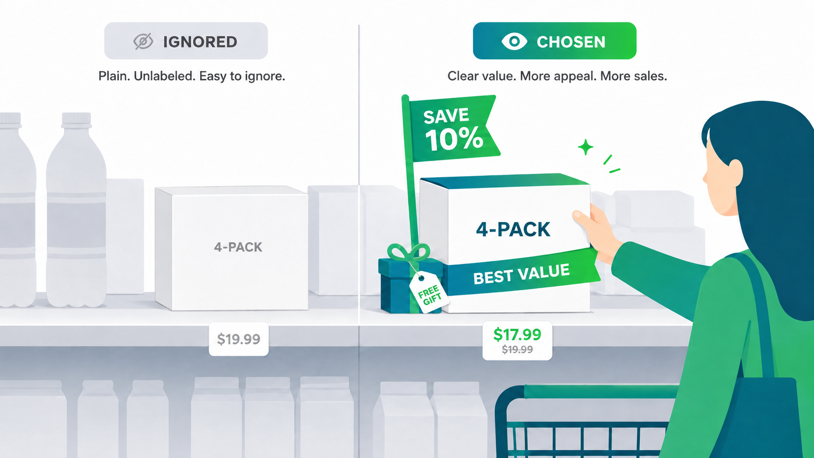
- Invisible at the decision point. The offer lives in a dropdown nobody opens or on a page nobody visits, instead of beside the add-to-cart button where the decision happens.
- No anchor. $18 with no $20 next to it reads as a price, not a deal. The entire discount you are funding goes unnoticed.
- Split product equity. A separate 4-pack listing divides your reviews, search ranking, and ad history across two URLs for what is really one product.
- Frozen presentation. A static pack cannot retitle itself for Black Friday, pin a gift to a tier, or test “Save 10%” against “$2 off”. It is one hard-coded offer, forever.
- Manual upkeep. Every price change now needs editing in two places, and the “bundle” has its own stock records to babysit.
Do this instead
- Keep the single fully purchasable: the evidence favours mixed bundling, not forcing packs.
- Put the ladder on the product page itself, with the original total crossed out next to the bundle price.
- Pre-select the tier you want sold, and label it honestly, from your own sales data.
- Attach one “free” incentive (gift or shipping) to that tier, not spread across all of them.
- Add urgency only in real promotion windows, and retitle the offer for seasonal moments like Black Friday or Valentine’s.
- A/B test the presentation instead of guessing which framing your shoppers respond to.
This list is, not coincidentally, a description of what MaxValue AI Bundles does out of the box. The widget you clicked above is it, running with AI-written titles, seasonal retitling, and automatic A/B testing on real stores.
And to the merchant who emailed us: keep your 4-pack. It is a good offer. It has just been doing all of its selling alone, in the dark, and it deserves better lighting.